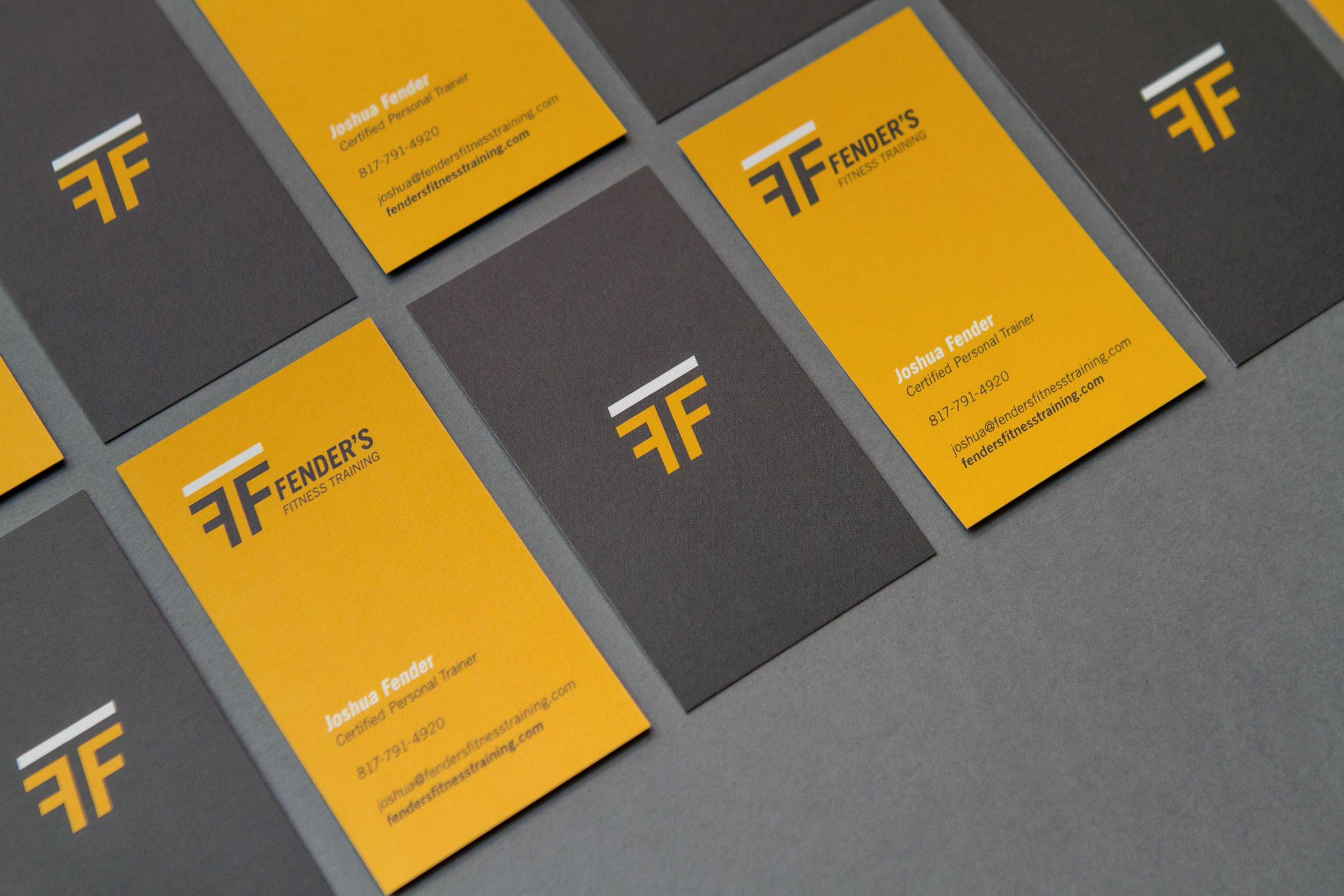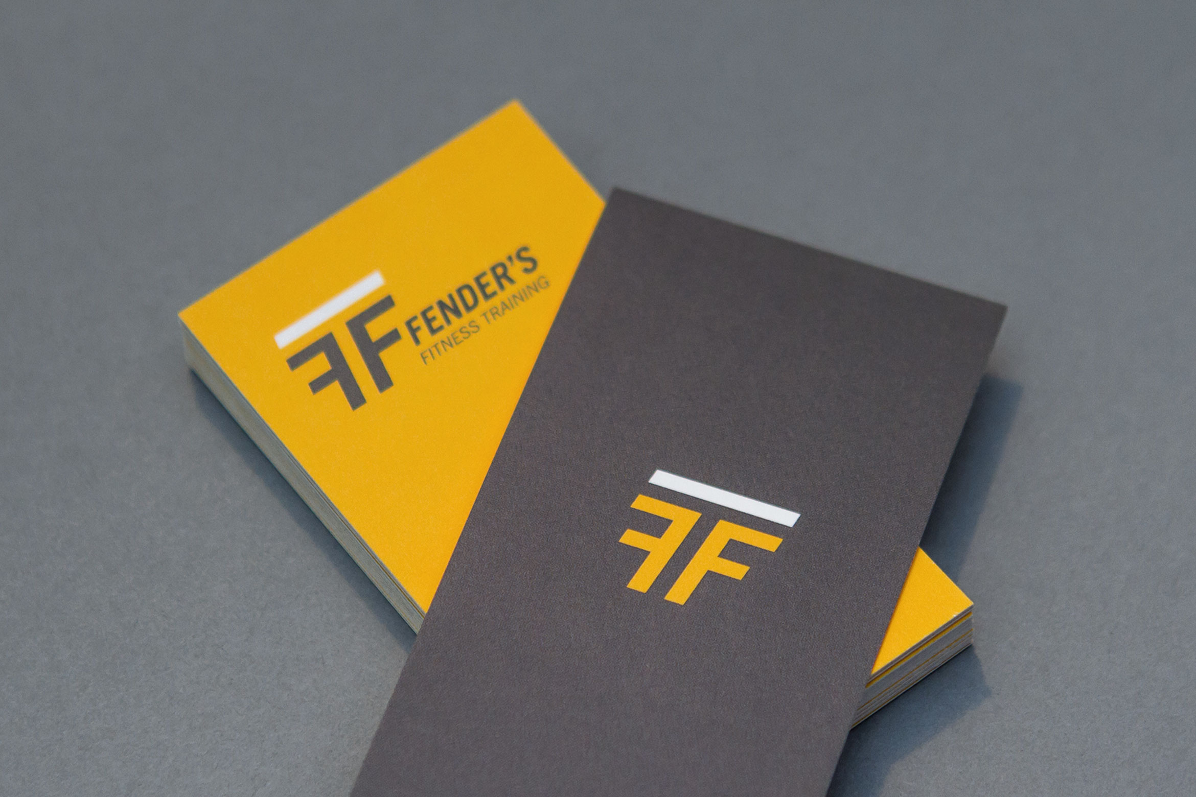
Fender's Fitness Training
—
Deliverables
Logo, Visual Identity, Print Collateral
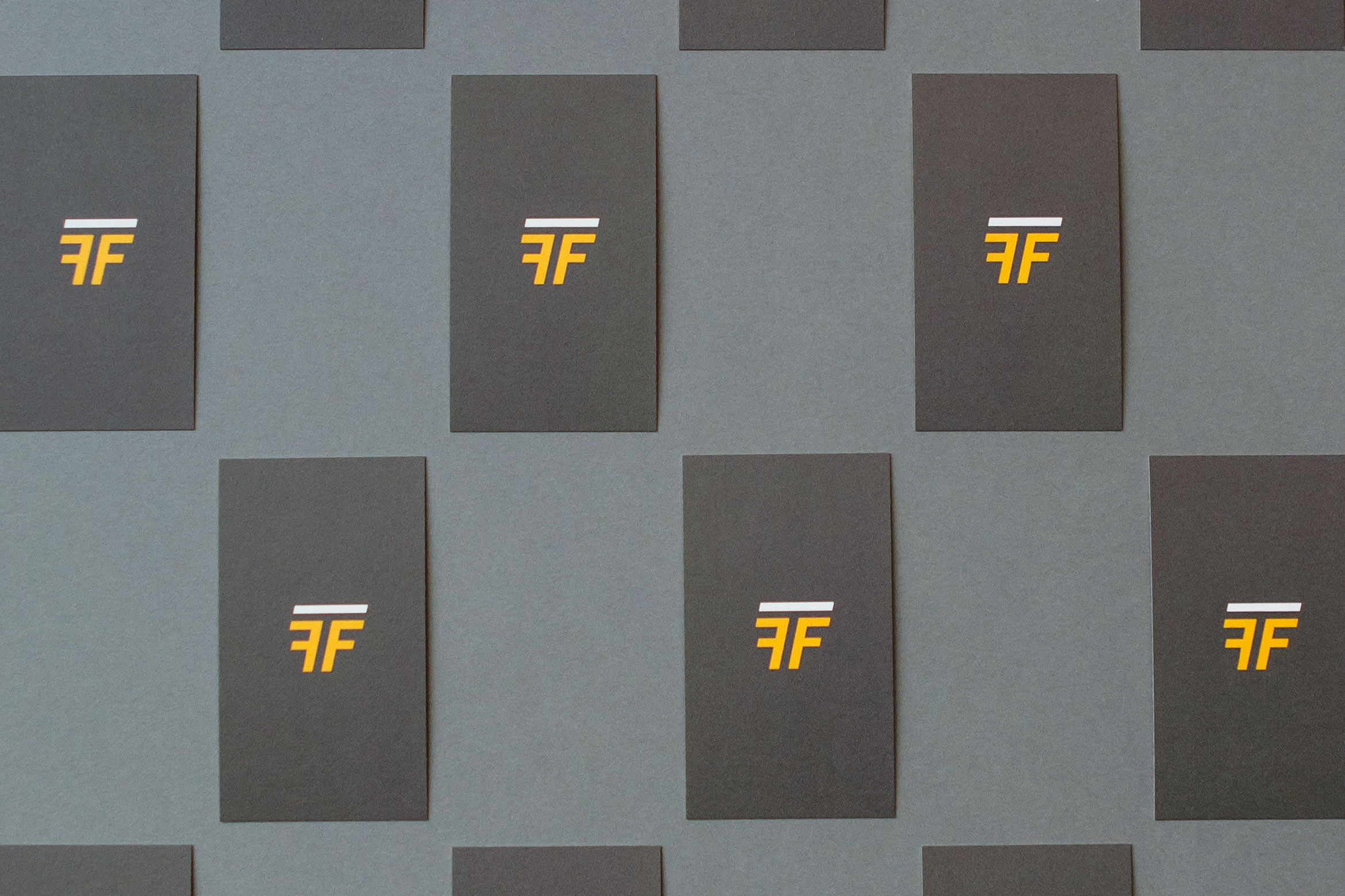
With an emphasis on fitness, the mark incorporates two letter Fs, and a reversed out letter T, in the center. An italicised posture depicts the letters in an active state, adding perceived motion to the mark. Additionally, the angular characteristics of the letterforms are reminiscent of various gym equipment.


We'd love to hear from you!
—
If you have a project you'd like to discuss, or just want to say hello, please get in touch.
Contact
—
hello@riflemandesign.com
Connect
—
Instagram
© 2017 Rifleman Design. All rights reserved.
